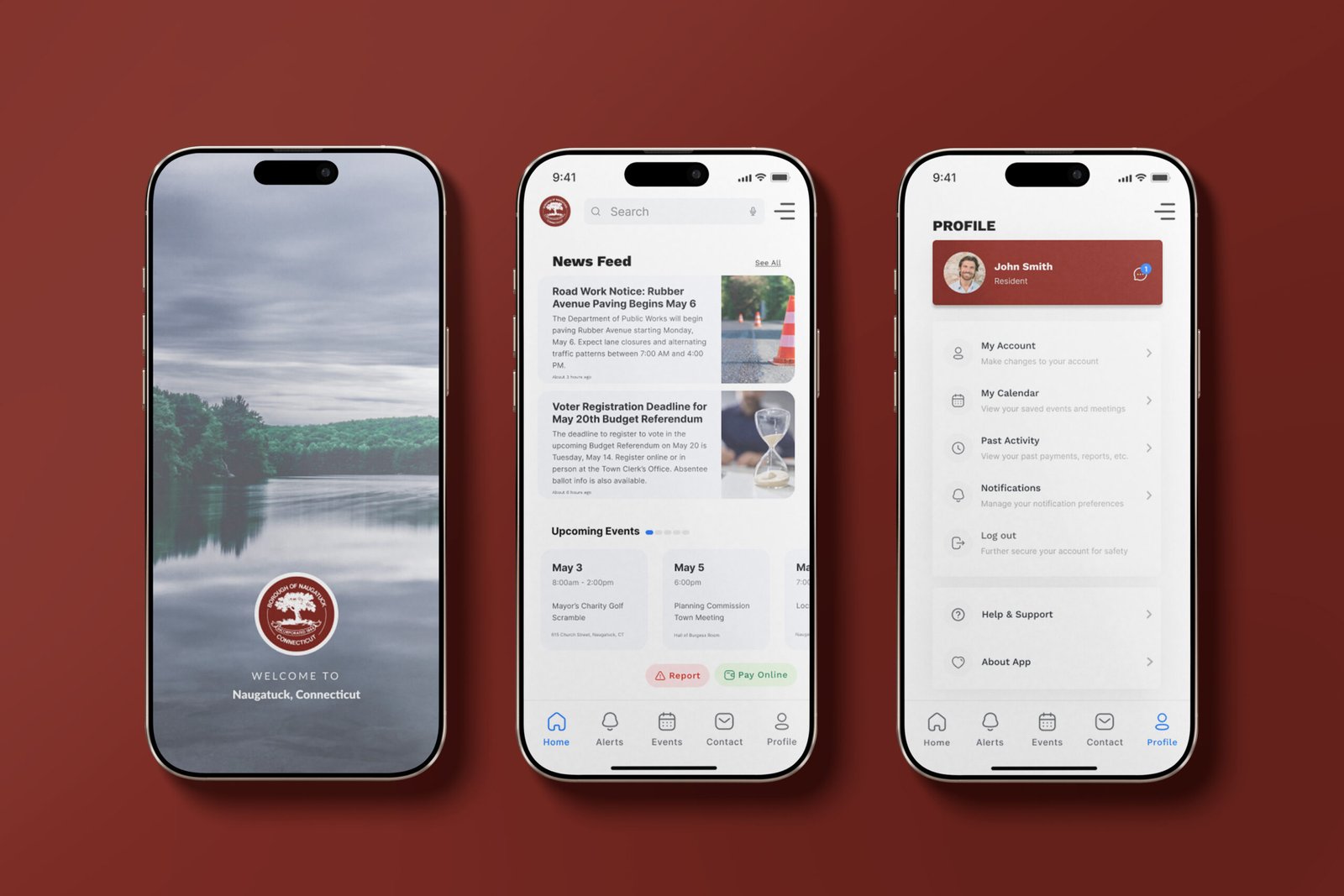
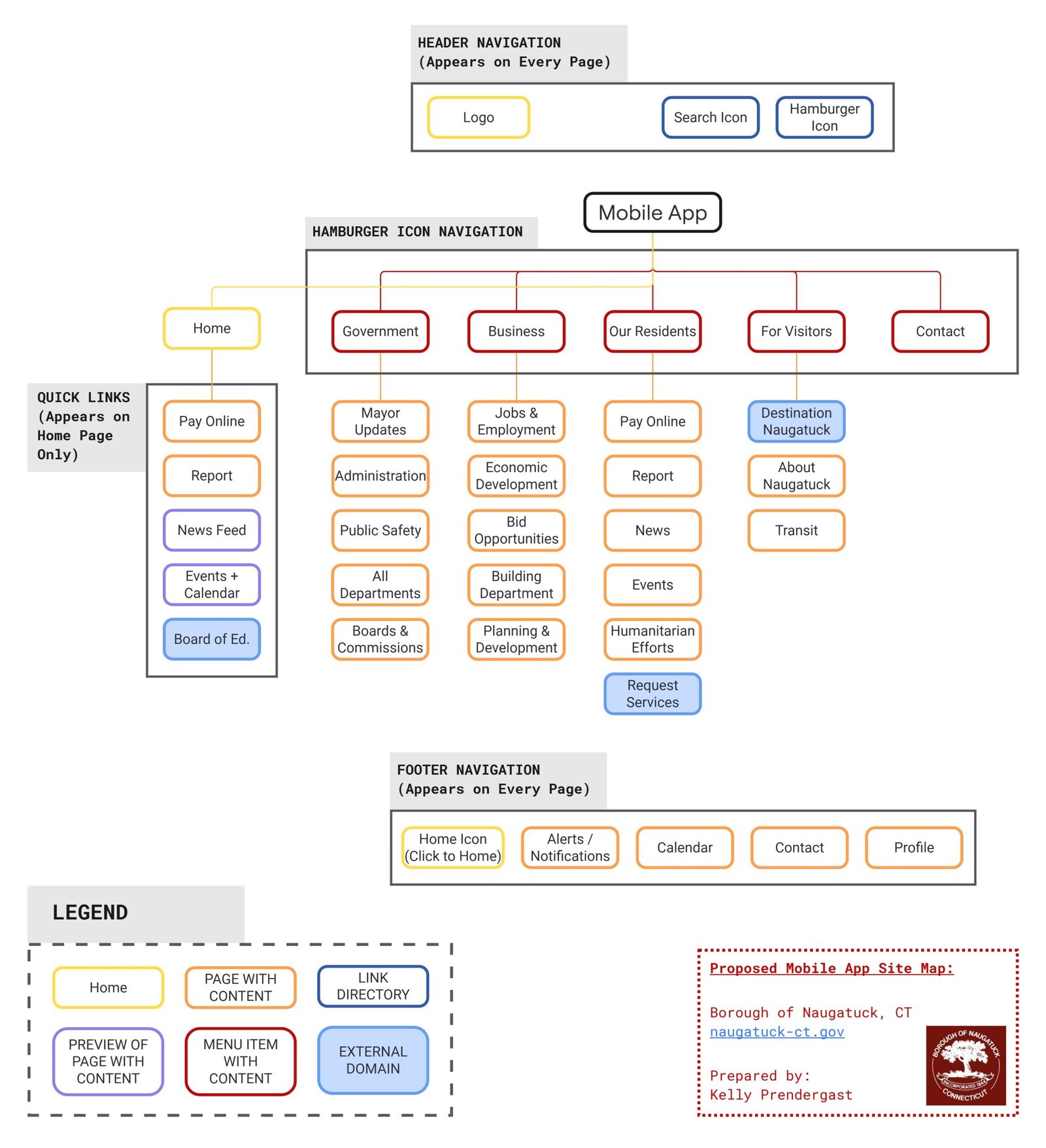
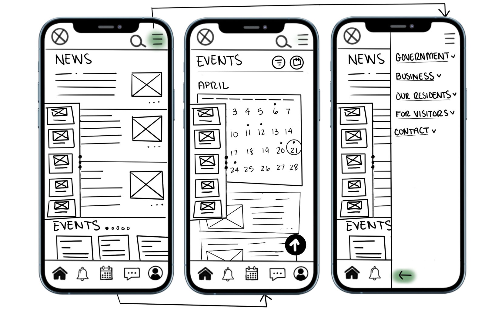
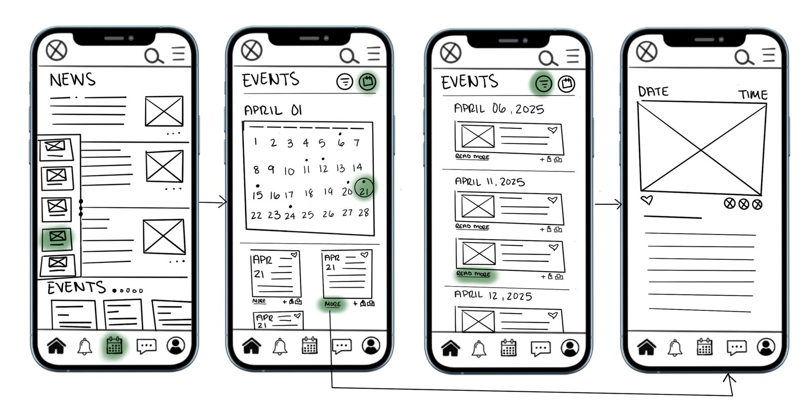
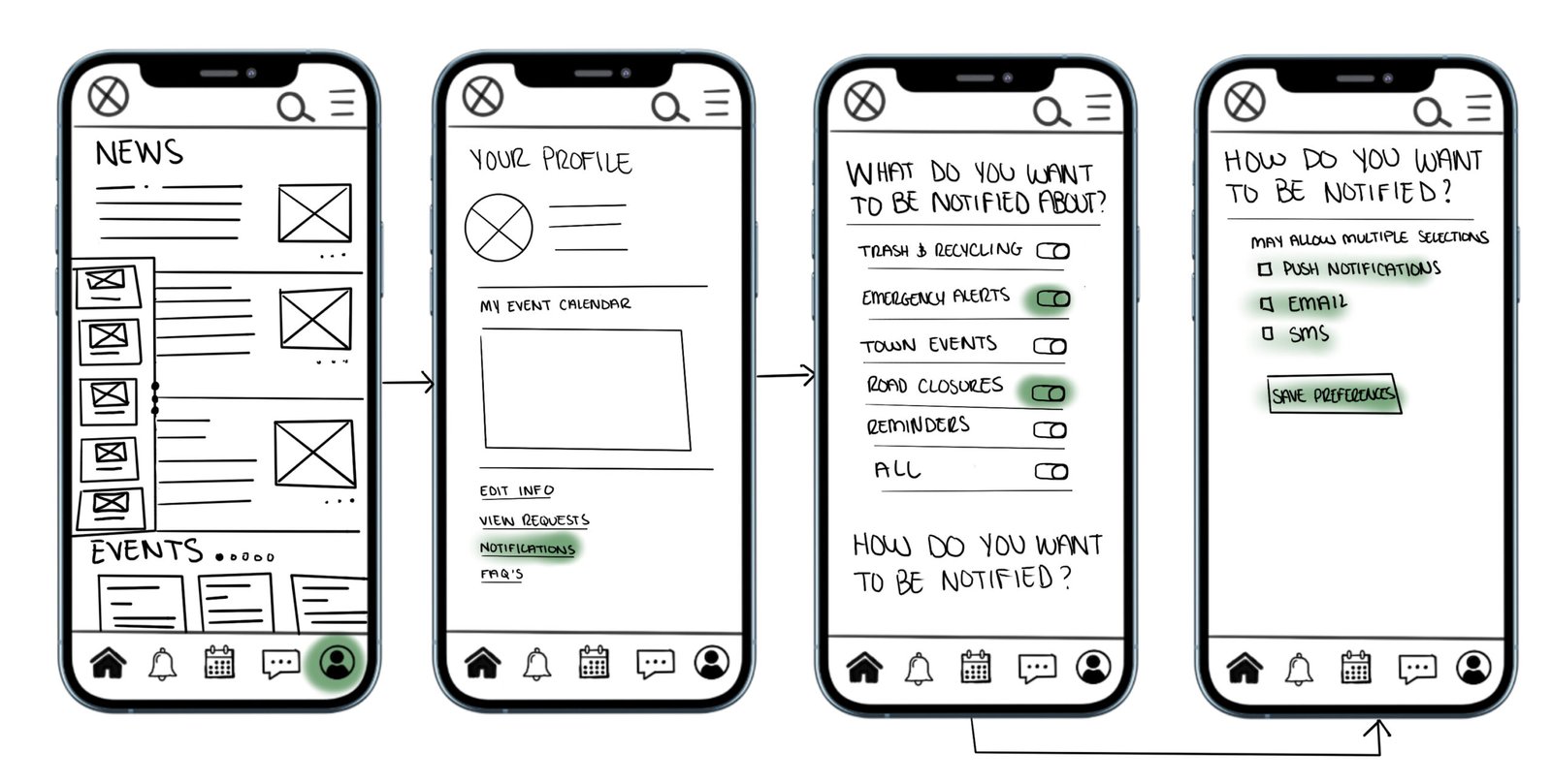
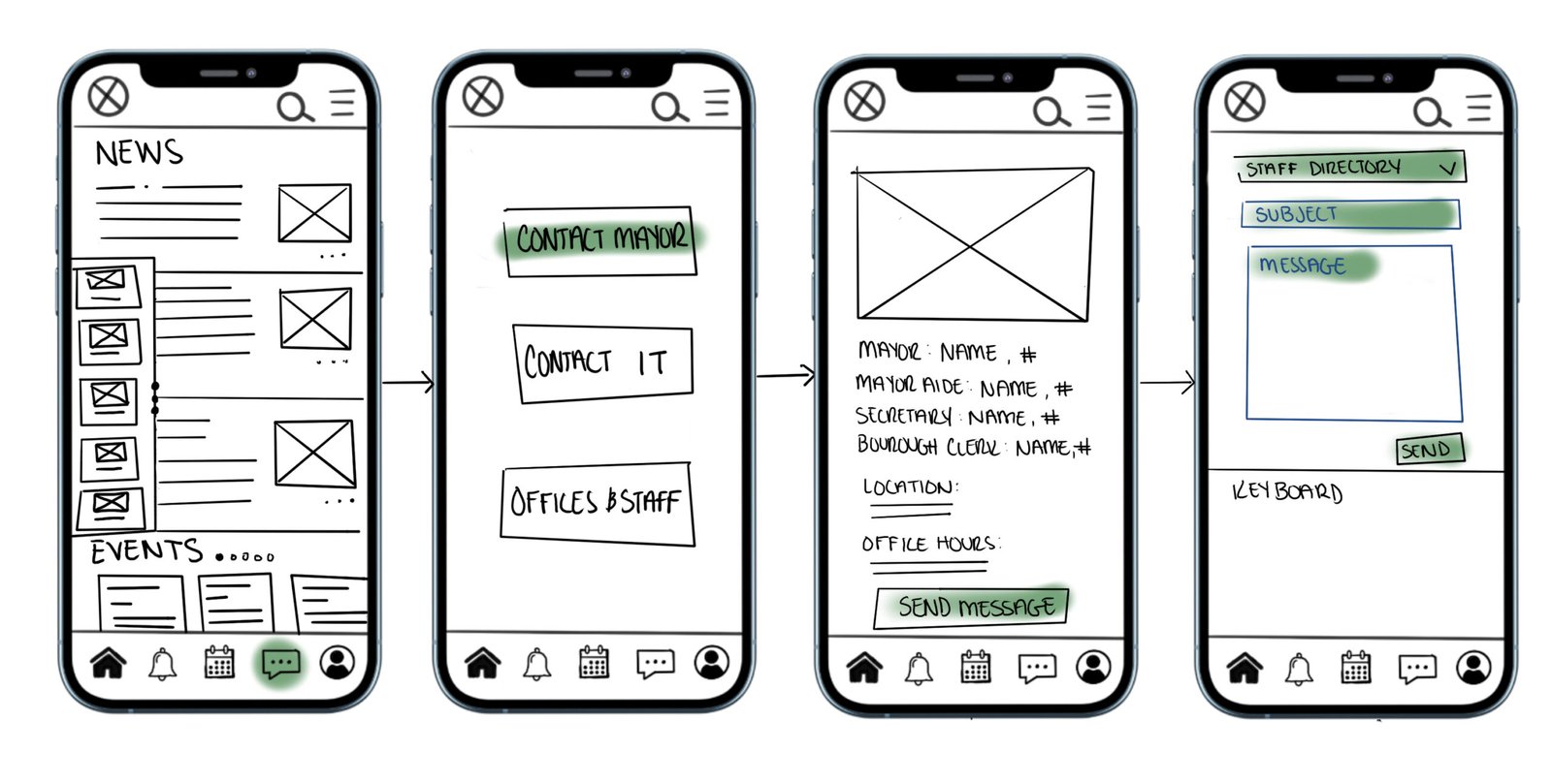
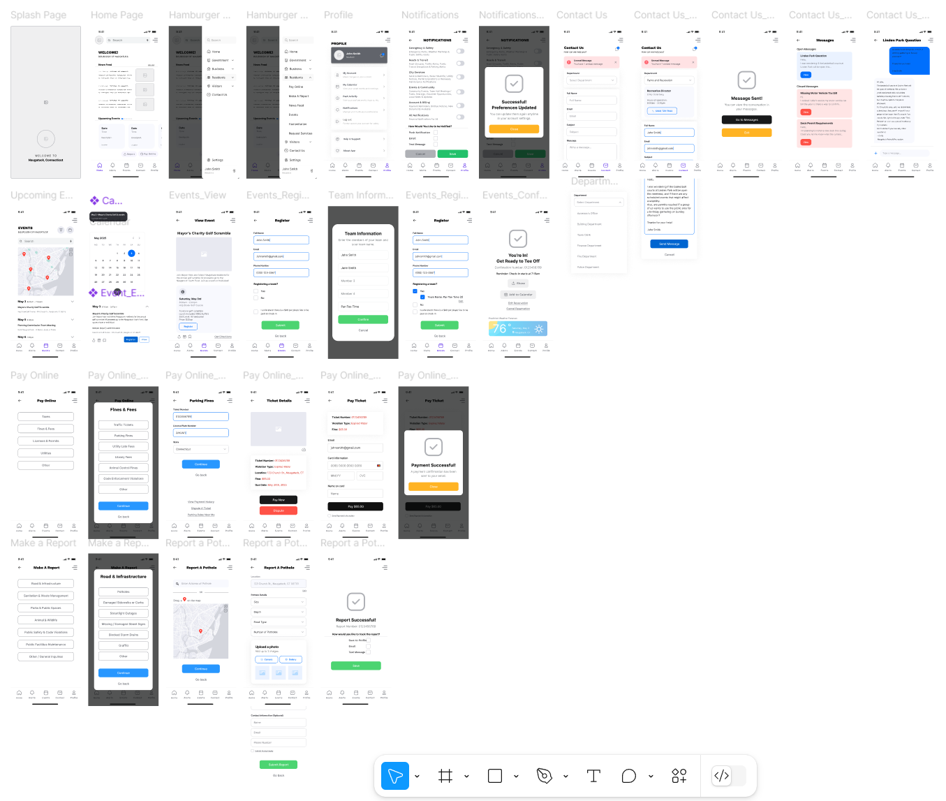
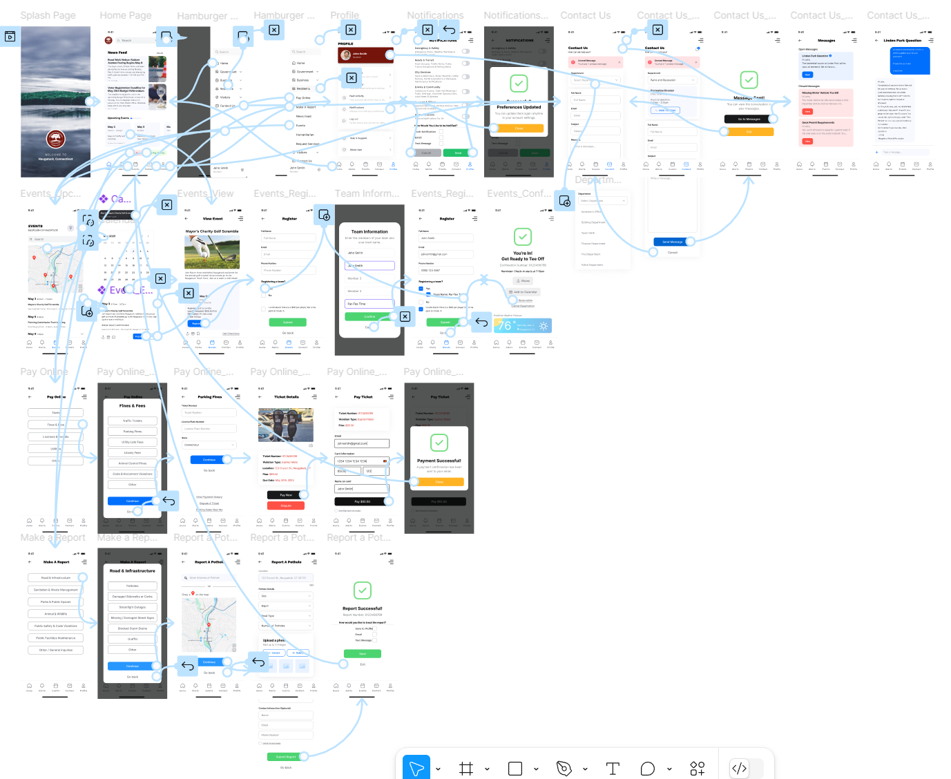
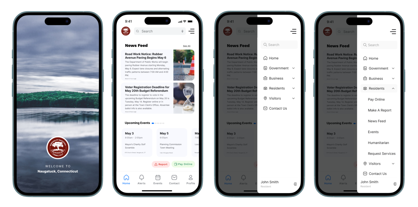
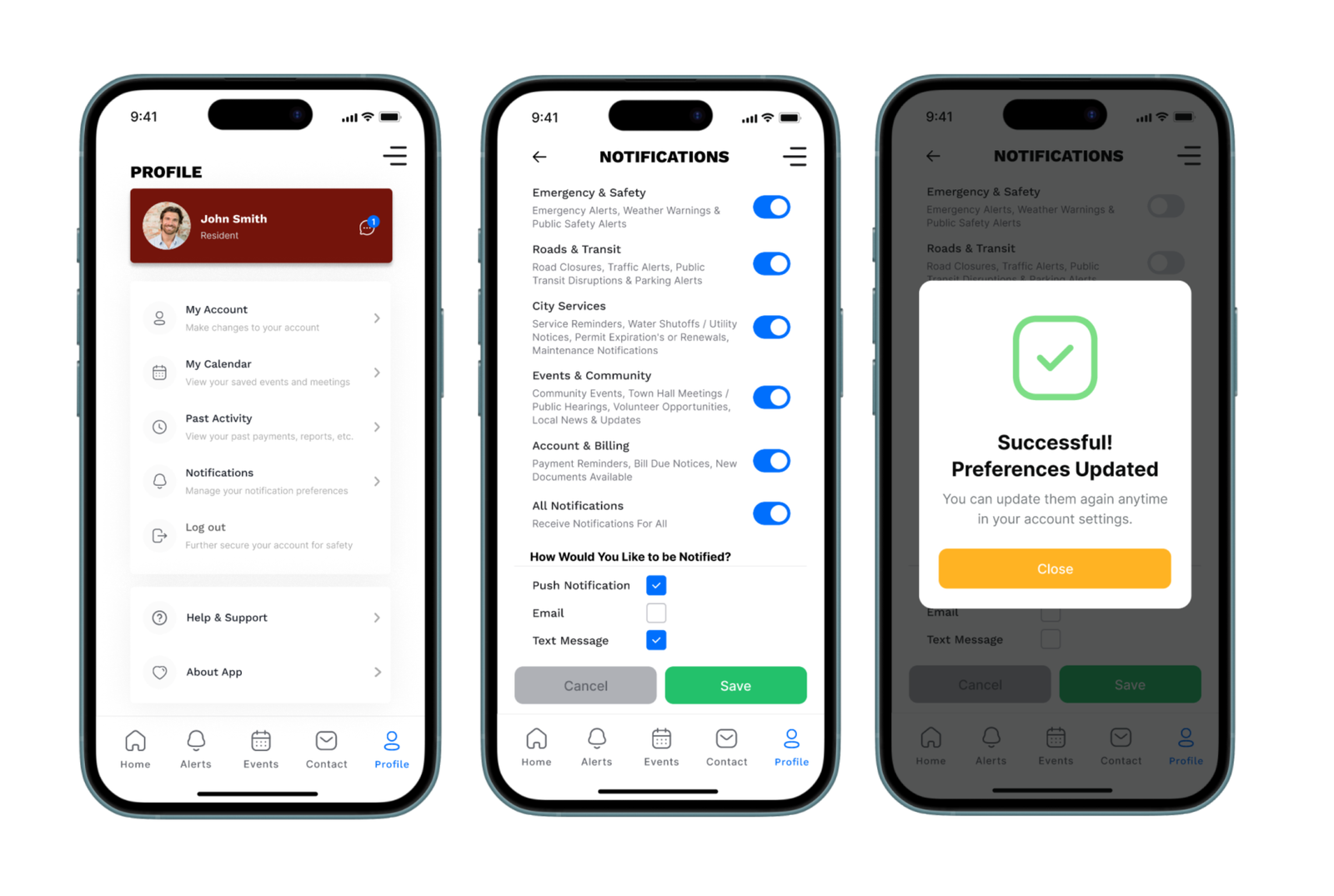
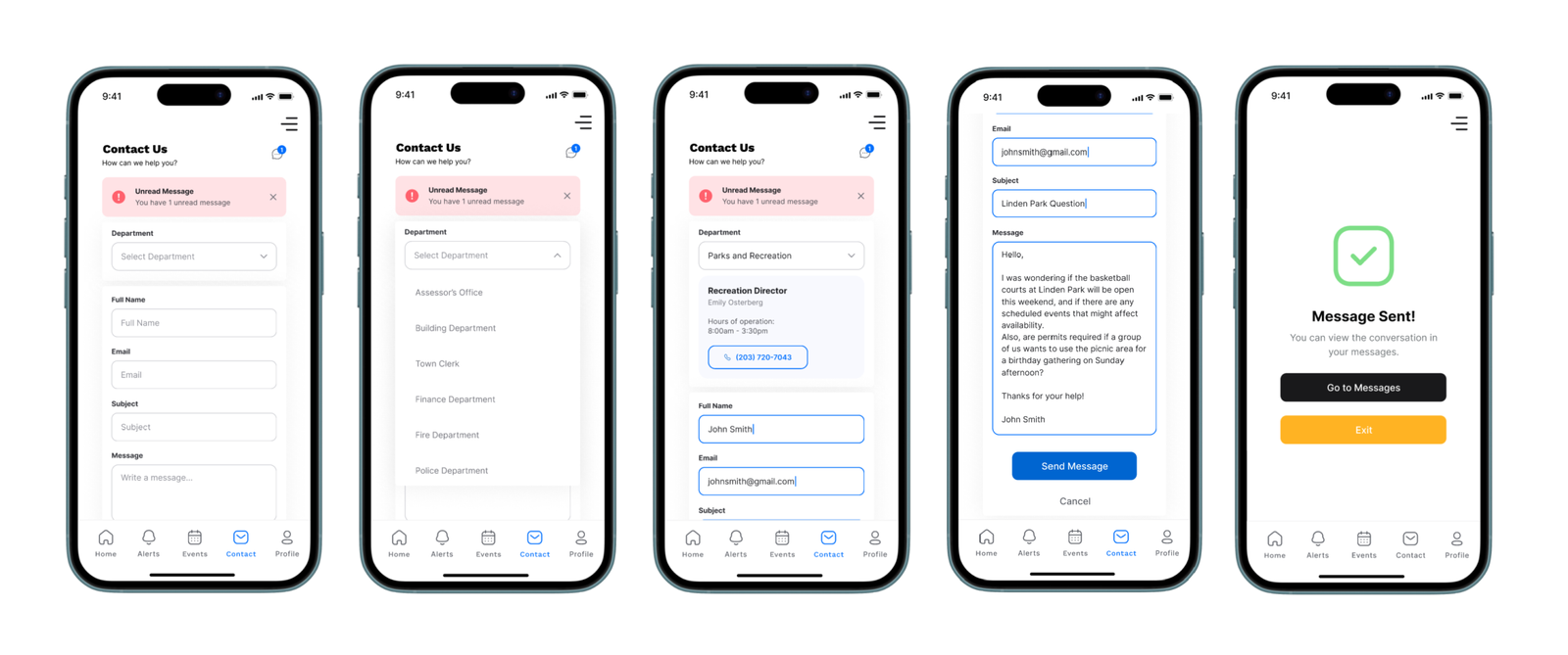
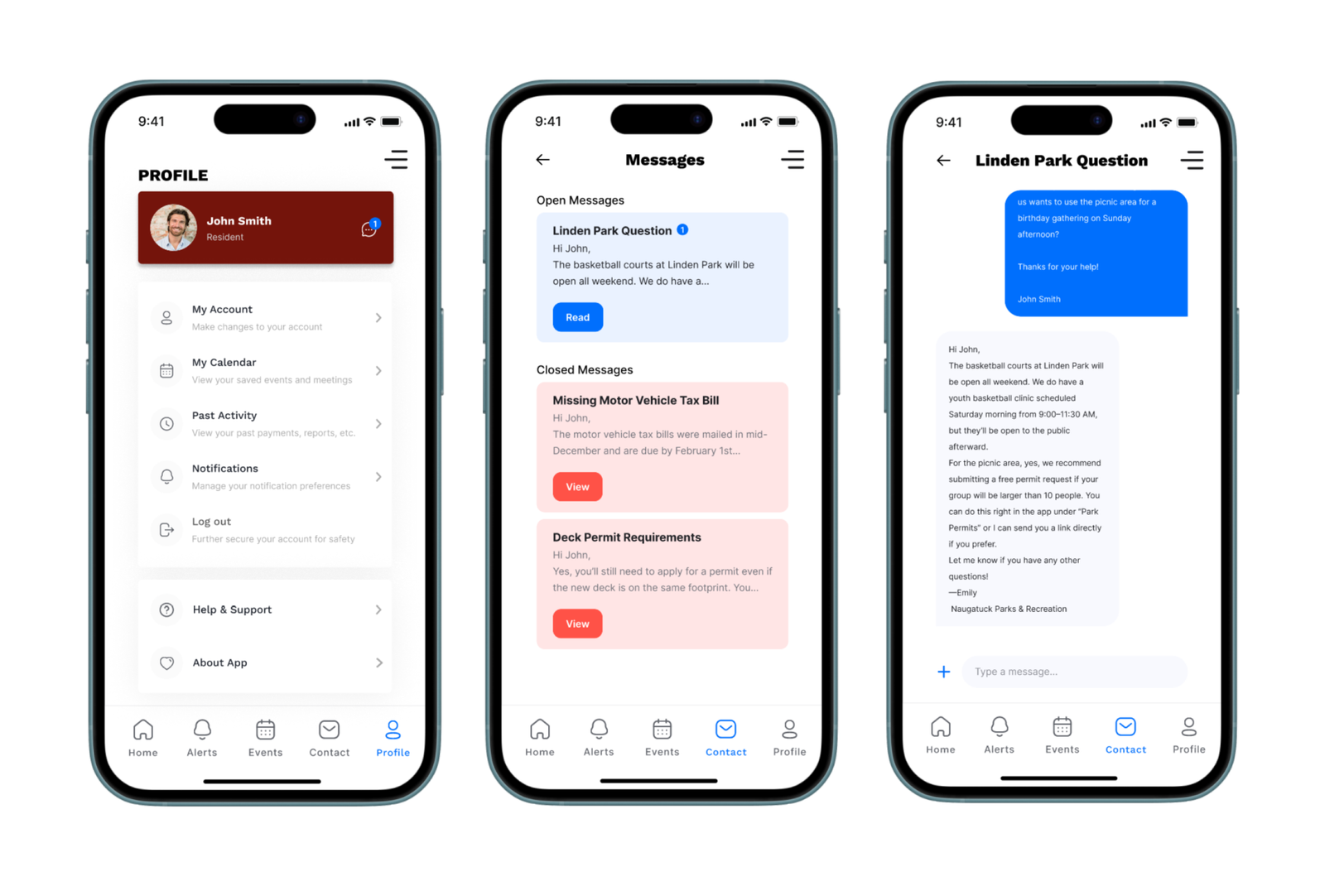
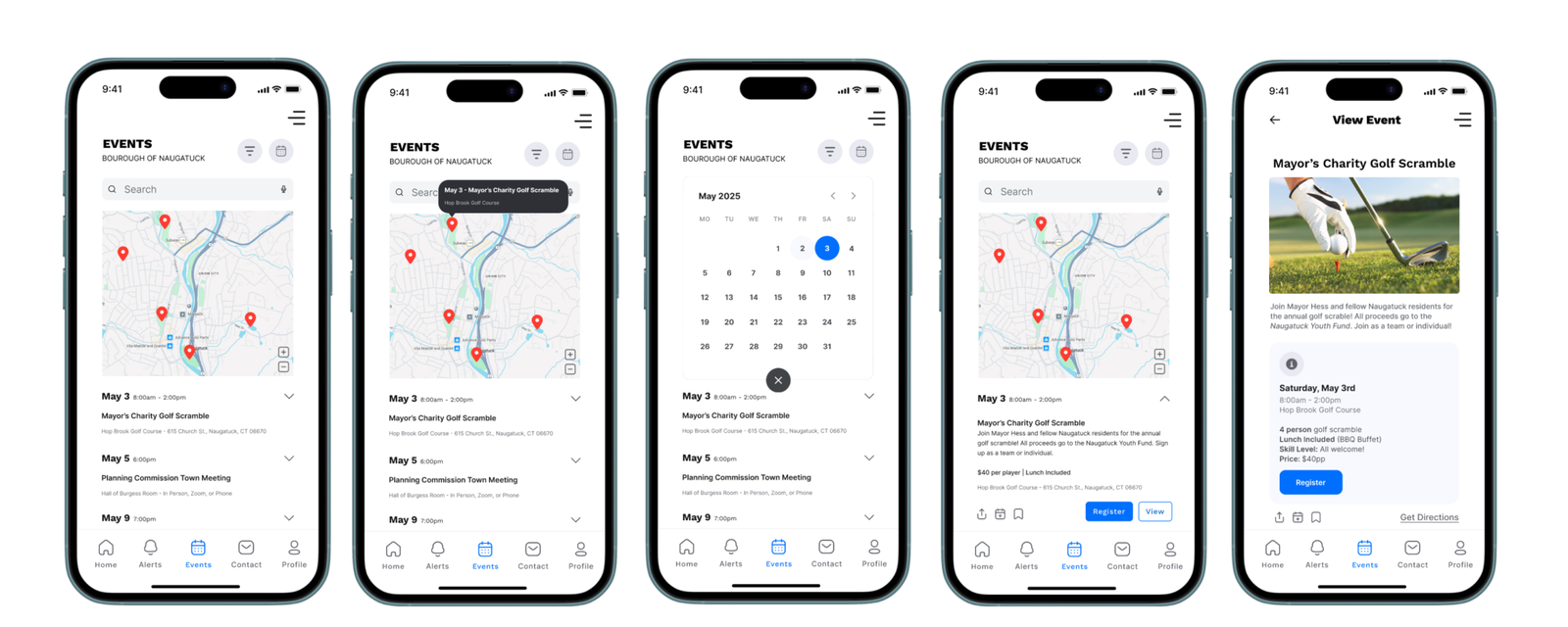
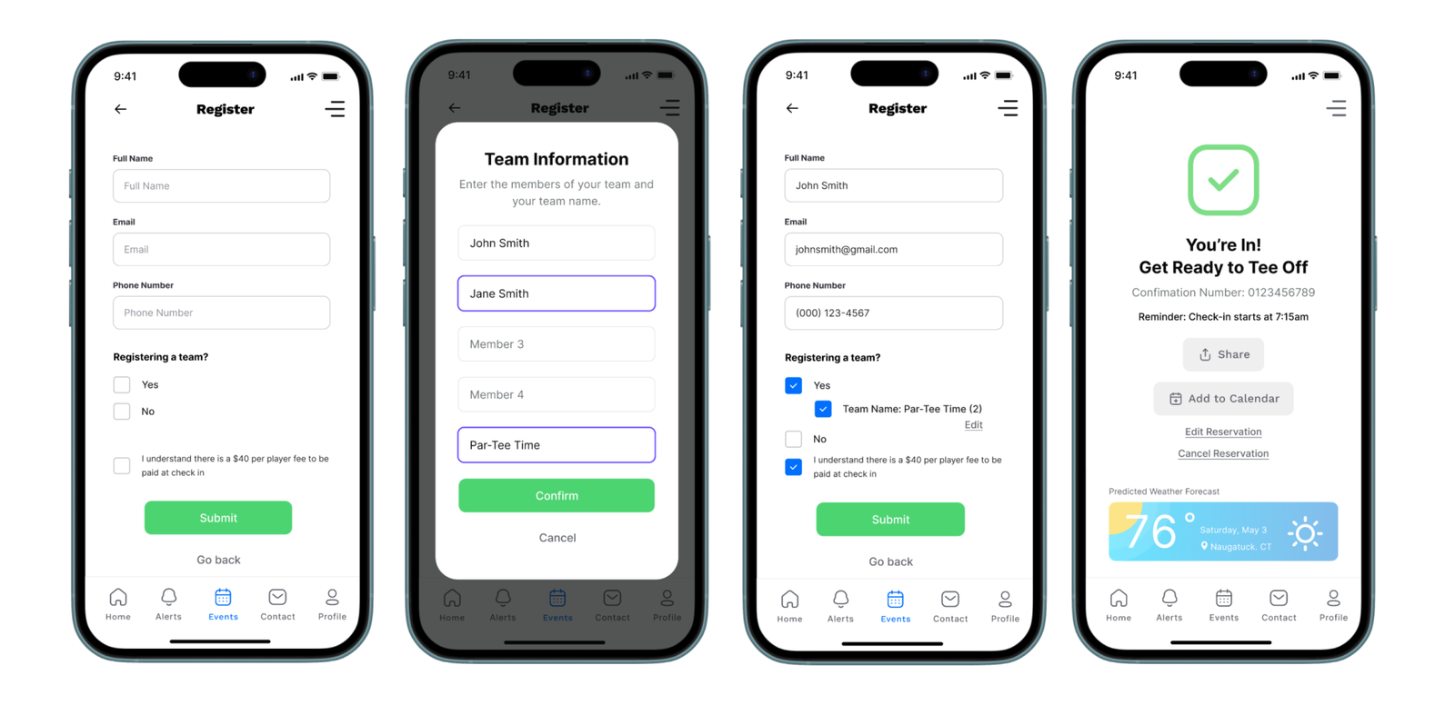
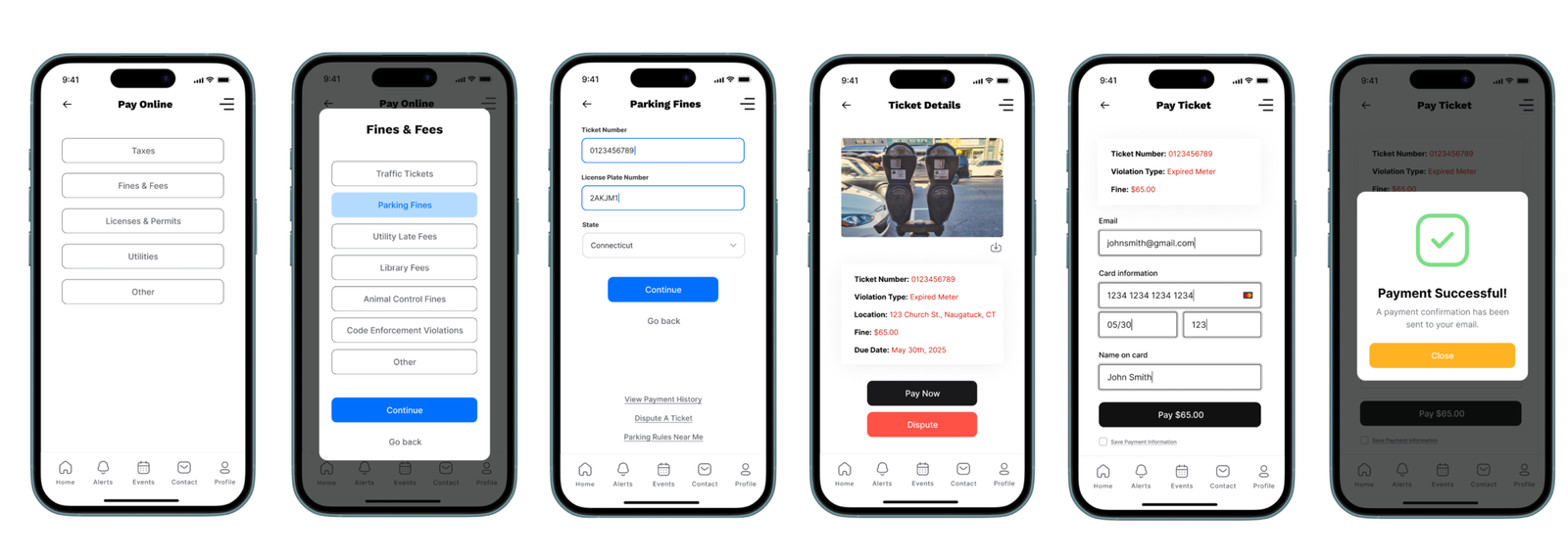
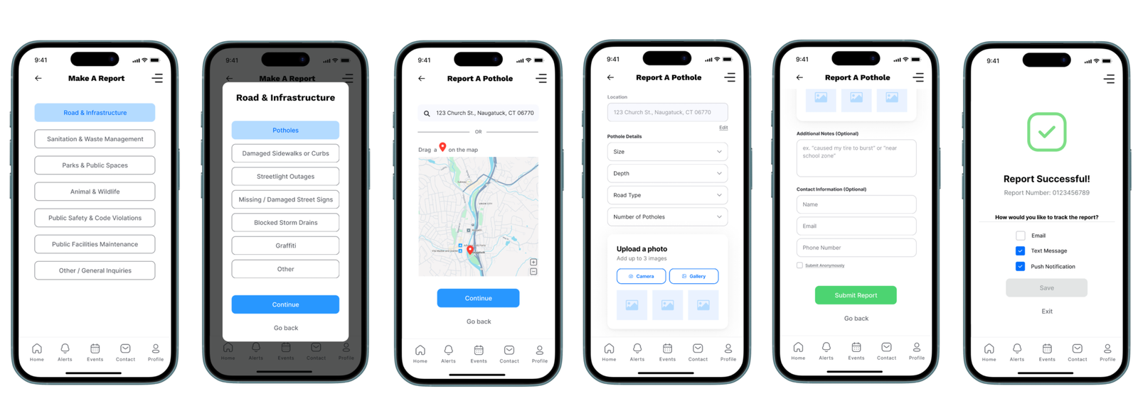
This project explores my end-to-end prototyping process for a mobile app concept, for naugatuck-ct.gov, emphasizing how early sketching, user testing, and iterative refinement lead to smarter design decisions. Starting with low-fidelity paper wireframes and evolving through mid- and high-fidelity prototypes, I focused on usability, visual hierarchy, and user flow. The case study highlights how prototyping not only uncovers potential issues early but also strengthens the final product through thoughtful, user-informed design.
Year
2025
Duration
5 Weeks
Category
UX/UI
Tools
Figma | Miro
Municipal websites are often cluttered, outdated, and difficult to navigate, making it frustrating for users to find essential information like services, events, and local resources. This lack of clear structure and mobile accessibility creates a disconnect between residents and their community, especially when users are trying to complete simple tasks quickly.
To address this, I designed a mobile app that simplifies access to municipal information through a user-centered, iterative prototyping process. Starting with low-fidelity sketches and evolving into high-fidelity designs, I focused on improving navigation, organizing content more intuitively, and creating a seamless mobile experience. Through testing and refinement, the final design delivers a clearer, more accessible way for users to engage with their local community.


Usability testing revealed that users were generally able to complete key tasks, but struggled with navigation clarity and information hierarchy in certain areas. Feedback highlighted the need for more intuitive labeling, simplified flows, and clearer organization of municipal services. Iterating on these insights led to a more streamlined experience, improving overall usability and making information easier to find and interact with.
Medium-fidelity mockups allowed me to explore layout and functionality without distraction from design polish.
High-fidelity prototypes became the polished, interactive version of the app that closely simulates the real user experience.
Screens: Splash Page, Home Page, Hamburger Menu
The splash page introduces the app that refreshes after loading to the home page. The home screen features a news feed, event preview carousel, quick buttons for payments and reports, and a bottom nav bar for fast access. A hamburger menu offers additional tools not found in the main nav.
Task: Customize Notification Settings via Profile Page
Users can toggle which types of notifications they want to receive and how they prefer to receive them (push, email, SMS). This screen was restructured to be more intuitive based on early feedback.
Task: Contact Parks & Rec with a Question
From the contact page, users can select a department, view contact info, and send a message directly in app.
Task: View Open or Closed Messages from Profile or Contact Page
Users can view all message threads with departments, similar to an SMS app interface. Threads show message status and allow ongoing conversations.
Task: Explore Calendar, Filter Events, and Register for the Mayor’s Charity Golf Scramble on May 3rd
Users can tap calendar pins, filter events, and view full event details. Registration includes a team sign-up option if applicable, confirmation, and calendar integration.
Task: Enter Ticket Details and Pay Online
A streamlined flow for users to pay fines, view ticket info, or dispute charges. Confirmation includes receipt delivery and reminders.
Task: Submit a Road Issue Report
Users select categories, drop a pin or enter an address, upload photos, and submit a report (optionally anonymously). They can also track reports through multiple notification methods.