WOODY’S WINGS
Kelly Prendergast | May - July 2023
Contents
Introduction
Research
Design
Iteration
Final Iterated Design
Conclusion
Introduction
Introduction
In a dynamic culinary landscape where convenience and personalized experiences are paramount, restaurant businesses are continuously seeking innovative ways to engage their customers. This case study will explore the objectives, key features, implementation strategies, results, and takeaways derived from the development of the Woody's Wings app.
Introduction
Problem
Inefficiency, engagement gap, competitive risk.
Woody's Wings faces challenges related to its current ordering process and customer engagement strategies. The traditional methods of ordering, which involve manual interactions and long wait times during peak hours, are leading to customer frustration and inefficiencies in serving.
Additionally, the restaurant struggles to maintain consistent engagement with its primarily local resident and college student customer base, resulting in missed opportunities to promote new offerings, events, and loyalty programs.
Without a modern and user-friendly solution, Woody's Wings risks reduced customer satisfaction, missed revenue potential, and a weakened competitive position in a market driven by convenience and personalized experiences.
Solution
Convenience, engagement, loyalty.
With a focus on designing the app around seamless ordering, personalized recommendations, loyalty programs, and real-time updates, the app seeks to enhance the dining experience and foster a vibrant community around the love for chicken wings.
Research
Research
In the digital age, where convenience meets culinary cravings, our restaurant app takes center stage. This research sets the tone for exploring the app's impact on customer engagement, operational efficiency, and overall dining experience. It will unravel key elements that impact our strategies, guiding us towards enhanced outcomes and enriched understanding. Let's uncover how this innovation is reshaping the way our patrons dine and interact with us.
Method
In this project, we took a systematic research approach. Through user surveys, data analysis, and comparative studies we aim to quantitatively and qualitatively assess the app’s impact on customer satisfaction, order efficiency, and engagement. This method ensures a comprehensive evaluation, allowing us to draw insightful conclusions about the app’s transformative role in modernizing Woody’s Wings dining services.
Research > Pain Points
Through conducted interviews I began to better understand the users I’m designing for and their needs. Two primary user groups were identified as working adults who don't have time to cook dinner and students who are too busy between classes or after extra curricular activities. These user groups confirmed initial assumptions about Woody’s Wings customers, but research also revealed that time was not the only factor limiting users from cooking at home. Other user problems included obligations, interests, or challenges that make it difficult to get groceries for cooking or go to restaurants in person.
Long wait times for placing orders, especially during busy periods, lead to frustration among customers and impact overall satisfaction.
Congestion
Difficulty maintaining consistent communication with the diverse customer base results in missed opportunities to promote new menu items, events, and loyalty programs
Disconnect
Inaccuracy
Manual order processing and lack of streamlined systems contribute to errors, affecting the accuracy of orders and potentially causing dissatisfaction among customers.
Research > Personas
Persona
PRIMARY PERSONA

“My daily schedule is ever changing and mostly sporadic throughout the entire day so I need a quick and efficient way to eat lunch or dinner without it costing much of my time.”
Name
- Kayleigh Guggenheim
Age
- 19
- University student, 3rd year
Education
- New Haven, Connecticut
Hometown
- lives with two roomates
Family
Occupation
- full time student
Goals: optimize food ordering amidst classes, have a safe study-eat environment, and maximize time for academics.
Frustrations: limited restaurant options with online ordering, time constraints for cooking and shopping, and dependence on local eateries due to transportation limitations.
Kayleigh is close to completing her third year as an Architecture student and is on the soccer team at her University. Since she lives off campus, she tries to avoid the food offered at the University due to its poor quality. Instead she prefers grabbing a quick bite at one of the many restaurants close by in the city of the University. Between her demanding class work and soccer practices / games, she finds little time to prepare lunch or make dinner at the end of her day and would like to have an option to order in advance from her favorite place to eat chicken wings.
Persona
SECONDARY PERSONA

“I enjoy trying new restaurants throughout the state that I live in and am always looking for an easy alternative to cooking for myself.”
Name
- Kevin Simon
Age
- 29
Education
- Bachelor’s Degree
Hometown
- Naugatuck, Connecticut
Family
- single, 1 dog
- software engineer
Occupation
Goals: optimize routine for work-life balance, discover nearby dining options, and prioritize personal time by minimizing meal preparation
Frustrations: “I opt for take-out due to limited cooking skills and time after work. Researching menus before trying new restaurants is essential for me, leading me to avoid places without this option.”
Kevin is a software engineer at a large company and has lots of hobbies outside of work. He is always looking to try new foods and restaurants. Since he works long days and sometimes works overtime he prefers eating out over cooking himself dinner. Kevin is also not the best cook and would rather not waste his time preparing a meal that he probably won’t enjoy anyways. He is looking for there to be an easier way to order food to-go on an app that he can pick up on his way home from work.
Research > User Journey Map
User Journey Map
Persona: Kayleigh Guggenheim
Goal: A fast and easy way to place and pick up food

Research > Competitive Audit
Competitor’s
Direct
Buffalo Wild Wings
An international casual dining chain that appeals to families and sports enthusiasts that offer 26 different types of wing and tender flavors.
WingStop
A fast casual dining experience with 13 chicken wing and tender flavors.
InDirect
Five Guy’s
An international burger joint that specializes in high quality and fresh ingredients appealing to all age groups.
Wayback Burgers
A fast casual restaurant focusing on burgers, fries and shakes across many demographic groups.
All have really strong and well developed websites and apps. They pay close attention to detail and make it easy for anyone to view what they have to offer and order for pickup or delivery right from the app. They also each contained features like store locators and an option to create an account.
Only Buffalo Wild Wings and Wayback Burger offered the opportunity to join a loyalty rewards program.
All competitors except for Wayback Burgers were sure to include many accessibility features like offerings the menu in different languages and having screen readers/magnifiers, speech to text software, etc.
All except Five Guys included images of all the food and drinks they had to offer.
Observations
Buffalo Wild Wings positions itself as a sports centric, casual dining restaurant for families and sports fans. Their audience ranges from 12-65 with people that are in the middle and upper income group.
Wingstop positions itself as a fast casual restaurant targeting 18-34 year old millennials.
Five Guys positions itself in a wide range age group where the people want high quality and tasty burgers, sandwiches and fries. All of their ingredients are fresh and they cook their burgers to order to satisfy their customers. It’s restaurant quality fast-food.
Wayback Burgers positions itself as a fast casual dining experience. They appeal to many demographic groups with the variety of food choice on their menu, but they specialize in finely crafted burgers, fries and shakes. Their audience tends to be working adults / young adults and teenagers.
Market Positions
Gaps
Five Guys and Wingstop have no loyalty rewards program and Five Guys does not offer images of menu items.
Opportunities
Provide a loyalty rewards program for returning users and provide menu with images.
Design
Design
Crafting user-friendly and visually appealing digital experiences that cater to users’ needs and emotions. It involves creating seamless interactions, clear navigation, and a balance between aesthetics and functionality. The goal is to establish strong user-product relationships that enhance satisfaction.
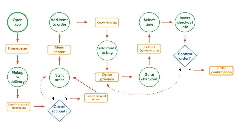
Design > User Flow
User Flow Scenario
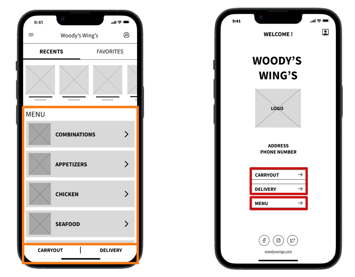
Design > Paper Wireframes
Hand drafting iterations of each app screen ensured elements transitioned effectively to digital wireframes, addressing user pain points. The home screen focused on vital components - navigation, profile tabs, images, and swift access for carryout or delivery choice. This facilitated a streamlined and efficient ordering process, ultimately saving users' time.
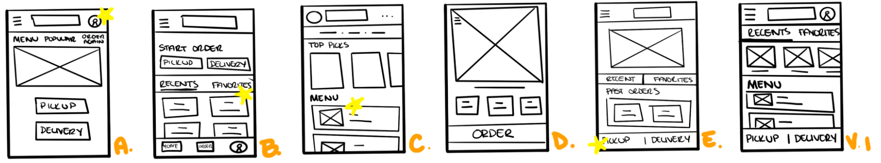
Stars were used to mark the elements of each sketch that would be used in the initial digital wireframes
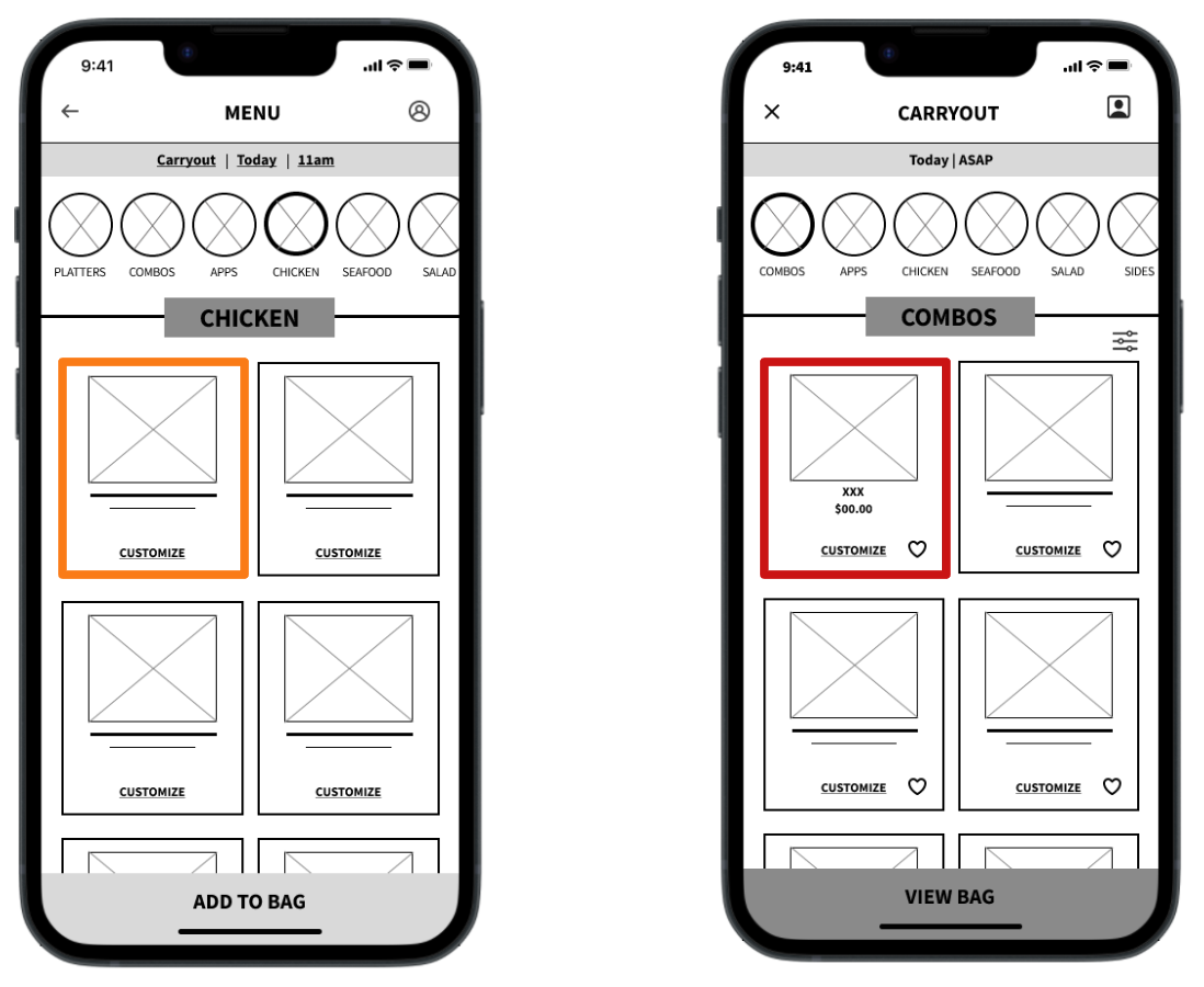
Design > Digital Wireframes
As the initial design phase continued, I made sure to base screen designs on feedback and findings from user research. Easy navigation was a key user need to address designs in addition to equipping the app to work with assistive technologies while making it efficient and functional to use.

Positioned atop the screen, these buttons give users the option to swiftly reorder from their list of recent or favored selections.
Nestled at the screen's bottom, these buttons provide users with a seamless initiation for their online carryout or delivery orders.
These buttons expedite users' journeys to their desired food categories, enhancing the ease of placing their orders.
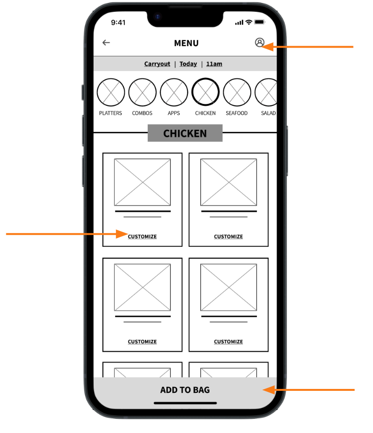
Crafted for user convenience, this button effortlessly enables users to personalize their food choices to align perfectly with their preferences.
Easy access to profile from any page in user flow
This button at the button of the screen makes it fast and easy for customers to order.
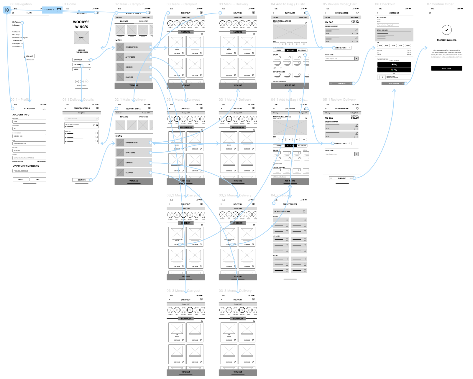
Design > Lo-Fi Prototype
The low-fidelity prototype seamlessly linked the app's core user journey of placing carryout or delivery orders, rendering it ready for a user-centered usability study.
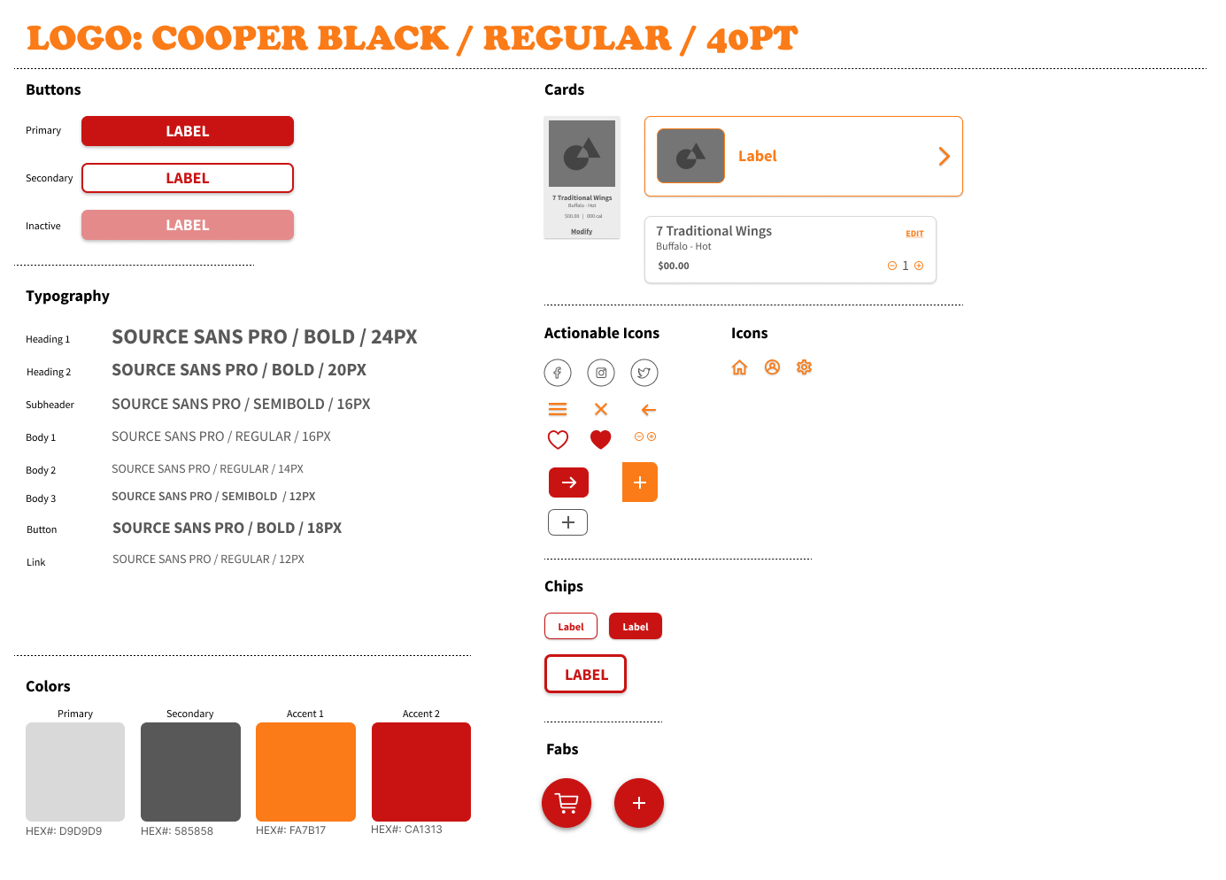
Design > Identity
Iteration
Iteration
Now it is time to refine and enhance our design through repetitive cycles of observation, studies and feedback. The low-fidelity prototypes will help gather user input, and identify areas for improvement. These insights will then be integrated into the design, resulting in a more user-centered and effective solution. Each iteration builds upon the previous one, allowing for gradual improvement and alignment with user needs and goals. This dynamic cycle ensures that the final design is well-crafted, intuitive, and capable of delivering an optimal user experience.
Iteration > Usability Study
Research Quesitons
How long does it take for a user to place an order through the app?
Are there instances within the app where the user becomes confused on what to do next?
Are there too many or not enough features throughout the app?
Participants
5 participants
Two males, two females, and one foreign individual, all between the ages of 16-60 years old:
Frequent Diner
First-time user
Time-conscious user
Tech-savvy user
Elderly user
Methodology
10-15 of minutes
United States, Remote
Unmoderated Usability Study
Perform tasks in a low-fidelity prototype
Iteration > Insights
Menu
First-time users and frequent diners both praised the app’s menu presentation and imagery, enhancing their ability to explore options and make informed choices.
Some users suggested a more effective way to view the entire menu, like through a PDF link.
Loyalty
Frequent diners and time-conscious users would like a loyalty program to be implemented so they can earn rewards for their visits or have quicker checkout times.
Features
Frequent diners and tech-savvy users commended the app’s user friendly interface, while first-time users sometimes encountered minor challenges in locating specific features.
Users wanted the option to favorite an individual item on the menu.
Home Page
Users found the app’s streamlined ordering process to be convenient and appreciated the ease and speed of placing an order, but found the home page to be overwhelming with information.
Iteration > Lo-Fi Iterations
After the first usability study, the home page had been simplified and a separate button was added linked to the restaurants PDF menu or the option to begin a carryout / delivery order.
After the first usability study, a feature to favorite an individual item was added to the design for the convenience of users in the future.
After the first usability study, an option to create your own account has been implemented into the design so returning and new customers can earn rewards and receive updates.
BEFORE
BEFORE
AFTER
AFTER

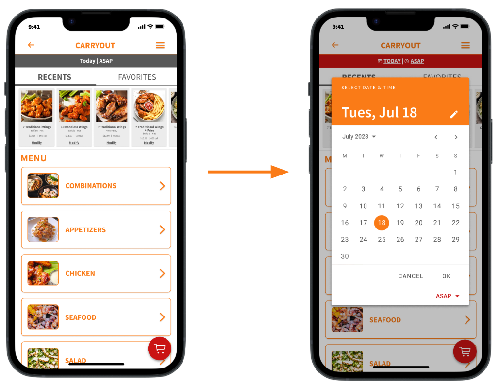
Iteration > Mock-ups
The second usability study revealed frustration with the attention to the schedule flow. I decided to have the calendar open up after carryout or delivery is selected so that it is the first thing to pop up before browsing the menu. This will ensure the menu and pickup or delivery times is accurate when placing an order. I also changed the heading to red and added icons to call attention to the banner.
BEFORE
AFTER
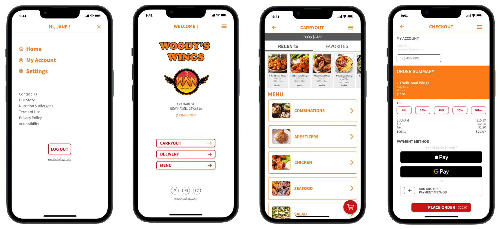
Final Iterated Design > Hi-Fi Prototype
The final high-fidelity prototype presented cleaner user flows for the carryout and delivery process. It also met user needs for a simplified home screen , full customization options and the option to create an account for loyalty rewards.

Conclusion
My journey to enhance the Woody's Wings app has been a dynamic and illuminating endeavor. Through rigorous usability studies and insightful participant feedback, I have gained a deep understanding of user preferences, pain points, and aspirations. By capitalizing on positive insights and actively addressing negative feedback, I am poised to transform the app into a true catalyst for seamless dining experiences. My commitment to user-centric design, improved navigation, enhanced accessibility, and optimized functionality positions Woody's Wings at the forefront of customer engagement in the modern dining landscape. I am confident that the app will not only meet but exceed user expectations, ensuring that every interaction with Woody's Wings is marked by convenience, satisfaction, and a dash of culinary delight.