Year
2025
Tools
Illustrator | InDesign
Category
Visual Design
Asset development for a Burning Man 2025 poster, exploring how layout, typography, and graphic elements can be structured to guide attention and strengthen visual impact.
Poster + Flyer
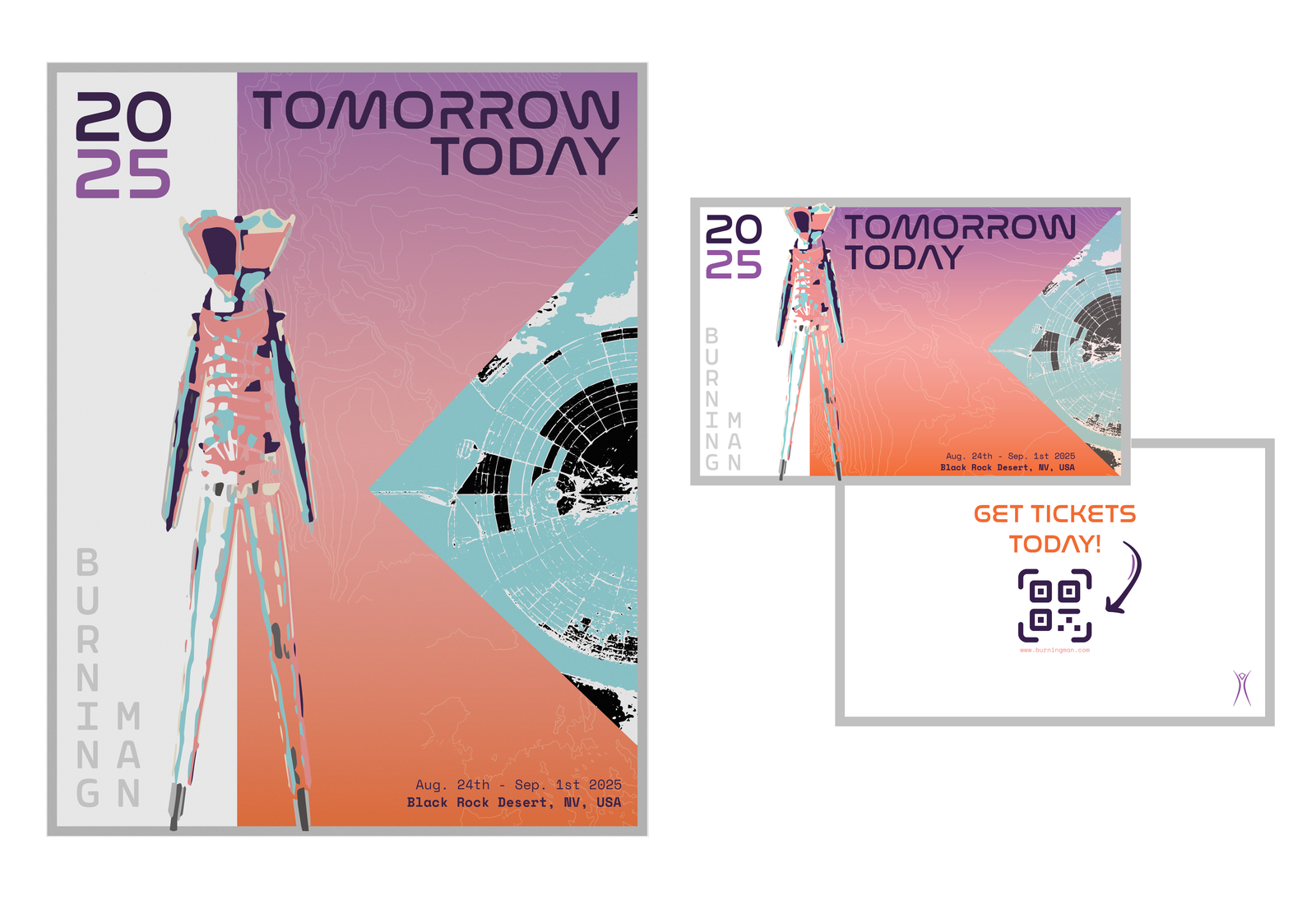
The poster is the hero of the set. It introduces the visual identity of the event through a bold layout: a gradient sky fading from desert orange to cosmic purple, echoing the sunset over Black Rock Desert. Overlaying that is topography, a nod to the land itself, and a triangular cropped aerial map of the festival grounds to give structure and balance.
The flyer mirrors the poster’s design, but with slight adjustments for scale and purpose. Since flyers are handheld, I added a back side with a QR code for instant access to the website and ticketing, bridging analog and digital, which felt super appropriate for the theme of “Tomorrow Today.”
VIP Badges
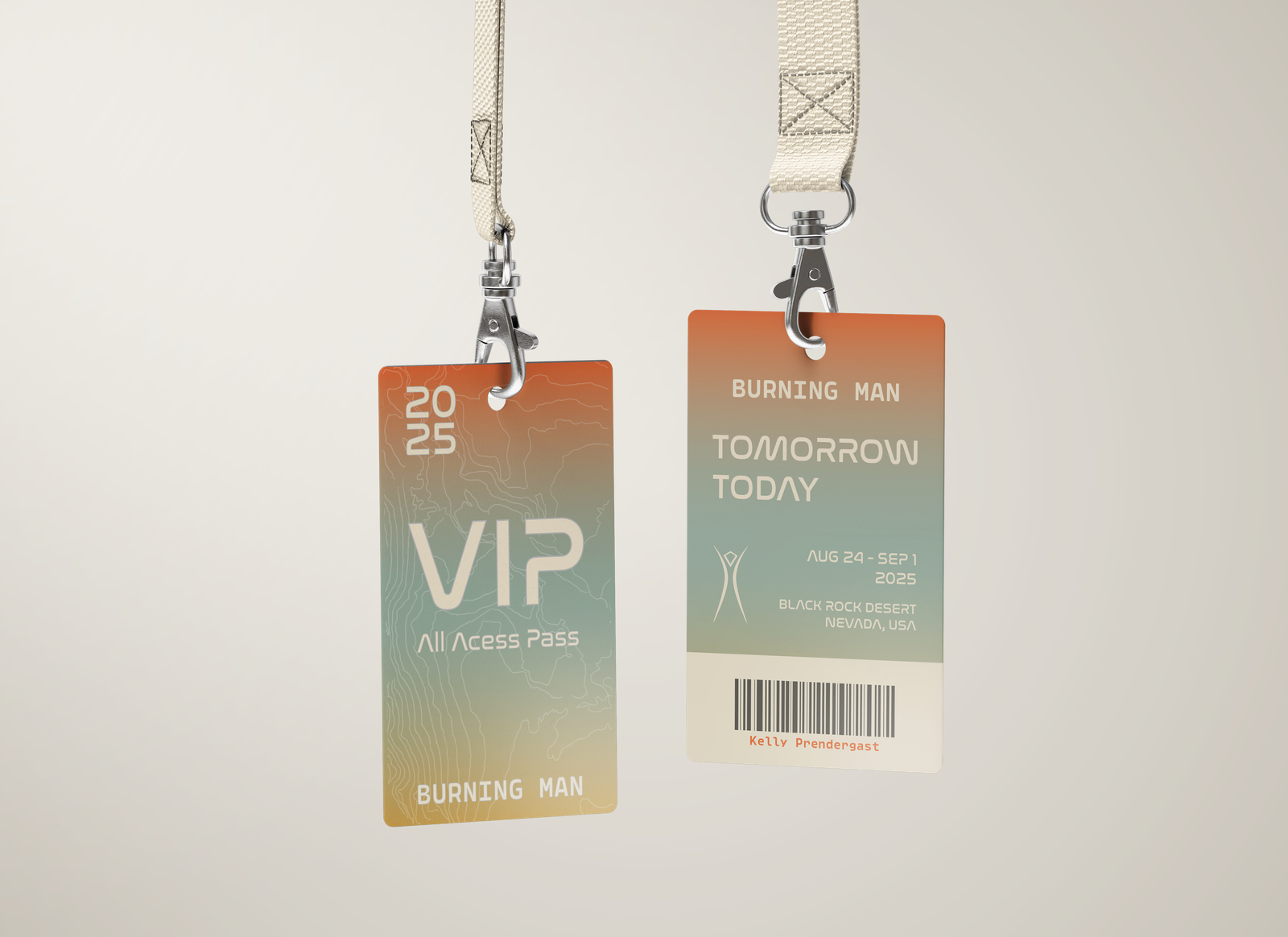
VIP badges needed to feel special, like a true exclusive pass. To set them apart while keeping them on-brand, I introduced a softer gradient with a teal-to-orange tone. It still references the desert, but it subtly shifts the vibe toward a more elevated, serene mood.
Facebook Profile
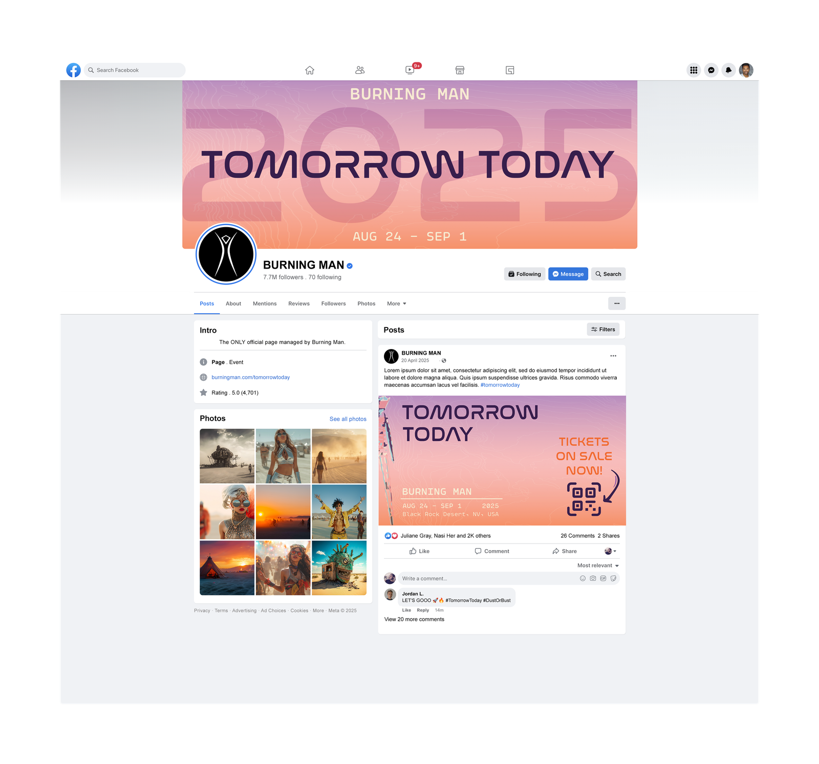
Digital layouts need to adapt to fast-scrolling behavior. With that in mind, I kept the banner minimal and text-centered: bold year in the background, title front and center, and a clean, color-forward aesthetic that’s instantly recognizable across devices.
The thumbnail takes a more promotional tone, “Tickets on Sale Now!”, designed with urgency and contrast in mind. The arrow and QR code are deliberate focal points to drive action, while still staying true to the overall visual theme.
Instagram Promo
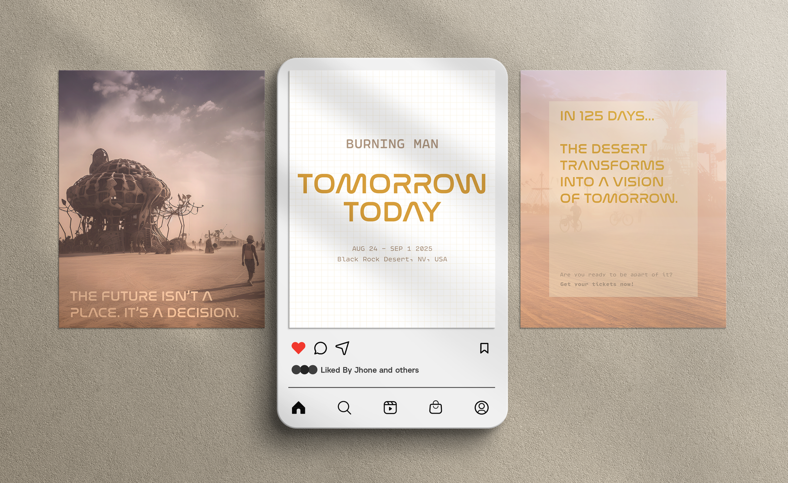
I kept the fonts consistent for brand unity, but used image-based backgrounds to catch the algorithm’s eye. According to engagement research, photo content performs better on Instagram, so this shift wasn’t just aesthetic, it was strategic.
The last post in the set is a countdown-style teaser, connecting to the anticipation and community-building aspect of the event. I wanted people to feel the build-up, not just see it.
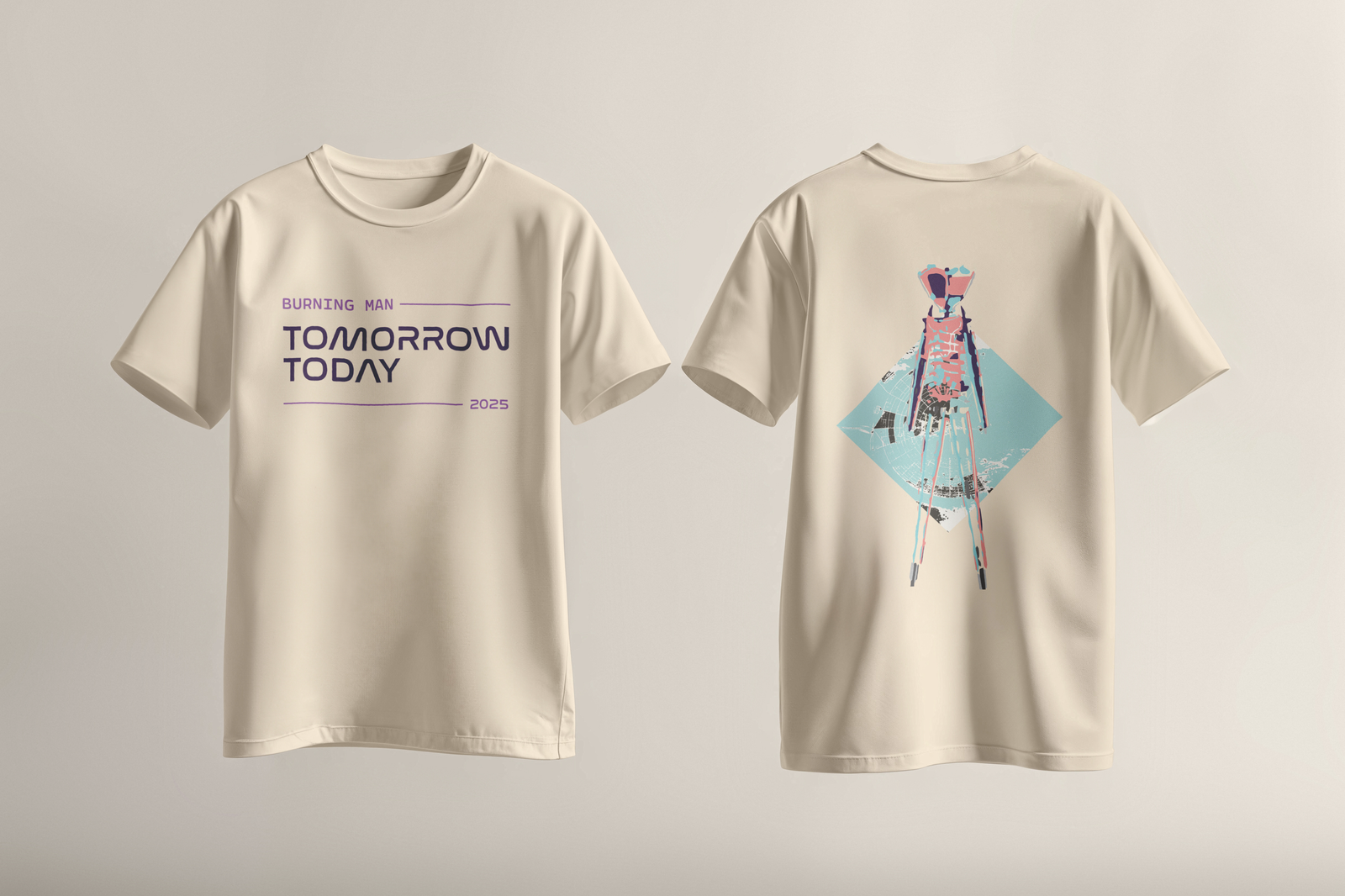
Event T-Shirt
I kept the fonts consistent for brand unity, but used image-based backgrounds to catch the algorithm’s eye. According to engagement research, photo content performs better on Instagram, so this shift wasn’t just aesthetic, it was strategic.